The following report uses a number of geolocation fields to create a report you can use with external tools to create heat maps.
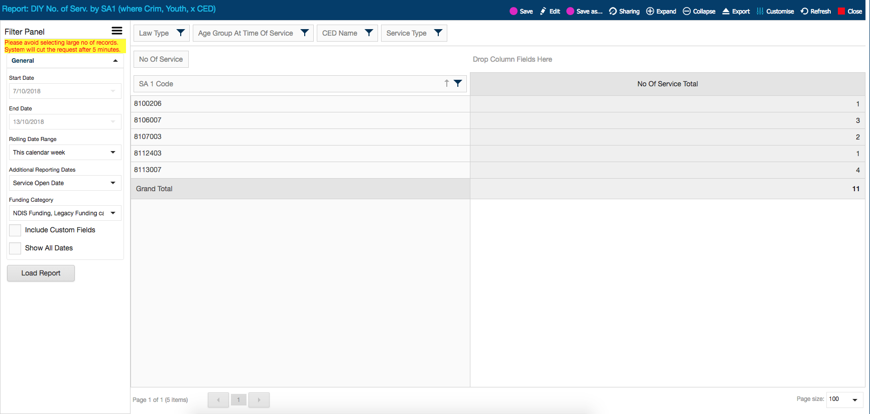
The following example report came from a request to see the number of services in each SA 1 area, filtered down to only youth clients, with criminal law problem types, in a particular Commonwealth Electoral Division. You can change out the fields and filters as needed – the main purpose here is to showcase the geolocation fields in DIY reports.
You can also arrange the fields so that the SA1 codes are columns, however then you would need a field in the row fields section – e.g. drag ‘service type’ down to row fields instead of filter fields section, as we see in the following screenshot:

Creating reports for heat mapping purposes opens up a whole new area of visual, high impact reports. They are useful for annual reporting, funding, outreach planning, CLE delivery, etc. When documentation is complete please refer to the guide on using CLASS data to create heat maps.